Latest From The Sayu Blog

01
Posted by Sayu Ltd

02
Posted by Sayu Ltd

03
Posted by Sayu Ltd
It’s essential visitors are able to get a real feel for the quality, finish and style of the sunglasses through the images available to them. Shoppers obviously can’t pick them up, inspect them and try them on as they do on the high street, therefore the product images have to help overcome these limitations.
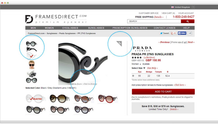
FramesDirect.com is a great example of how to do it right. They offer the visitor the ability to view their selection at a variety of angles, zoom-in for closer inspection and view the sunglasses on a model allowing customers to see how they look in a more realistic and ‘to-scale’ setting. Visitors can even upload an image of themselves to get an idea of how they might look.
In the 3 case studies described here: larger images led to an increase in conversions.
One of the first queries visitors often have in mind once they have decided to buy online is to do with delivery; “When will it be delivered?” and “How much will delivery cost?”
Data from a recent comScore survey shows that one of the most important factors when checking out online is seeing the estimated delivery date and shipping cost early in the shopping process, with 63% of respondents agreeing on this. The research also showed that the most popular reason shoppers abandoned a checkout process was because the shipping costs made the total purchase cost more than expected.
So clearly it’s important to state the delivery and returns information upfront.
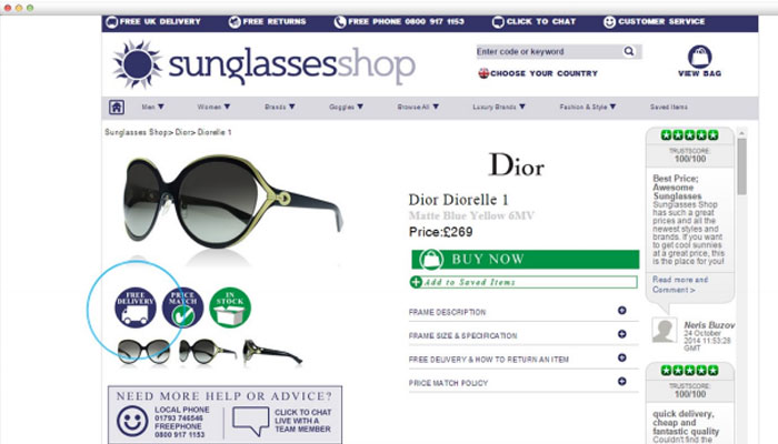
Sunglassesshop.co.uk is a great example of a product page that effectively communicates their delivery terms. They offer free, next day delivery; so they shout about it!
Emphasising the prospect of something being in short supply can create a sense of urgency about getting your hands on a product. A clever way of achieving this online is to visually alert visitors when the product they’re looking at is running low.
EyeEarBrands.com does a great job of this by highlighting when stock levels are low for certain products.
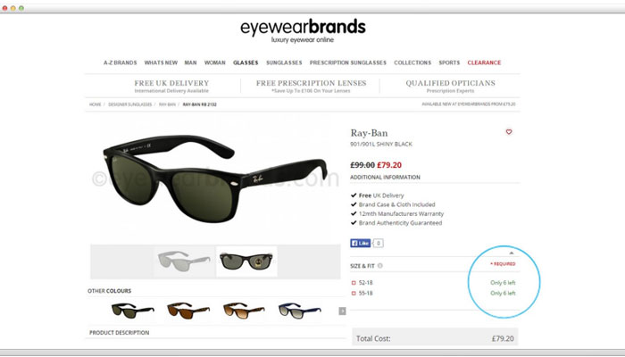
Creating urgency can force the difference between a visitor saying “I’ll have a look elsewhere and come back later” (and then never doing so), and actually buying there and then
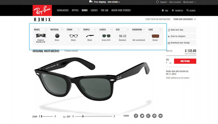
Are some of your products made of slightly better material? Or does the lens come in a more popular colour?
Showing shoppers similar products, or a display of products from ‘customers that bought this also bought’, can encourage users to buy more expensive items, or increase their basket size. The trick is to be clever and choose product suggestions based on 1) how related they are to the original product and 2) being sensitive to the price range of your customers.
According to PredictiveIntent, on an analysis of their client base, over 4% of sales were driven by upselling, whereby visitors were shown similar, more expensive products than the one in view.
RayBan do a great job of this by inspiring visitors to customise (and add £’s to) their selection
Product pages can make or break a sale and by testing various aspects on a page you will be able to identify the main elements that drive sales on your website