Latest From The Sayu Blog

01
Posted by Sayu Ltd

02
Posted by Sayu Ltd

03
Posted by Sayu Ltd
The category page plays an extremely important part in the buying process. Most people browsing a website will use a category page to help track down the product they’re looking for, therefore it’s important your category pages are designed to help users accomplish this.
The act of hopping, or pogo-sticking, between category page and product page multiple times is a proven conversion killer. According to some research, “shoppers who used pogo-sticking were one-third more likely to quit shopping following their pogo-sticking session than other shoppers. Not only did pogo-sticking result in fewer immediate purchases, but it also reduced the likelihood that the shopper would remain on the site and continue shopping.
The role of the category page therefore plays a pivotal role in driving more sales; particularly, we have found, in the fashion sector. Here are 5 tips to help you get more sales out of your category pages:
Retailers can find themselves torn between creating a category page that includes as much information as possible to prevent pogosticking, and a page that is easy-on-the-eye and not too cluttered.
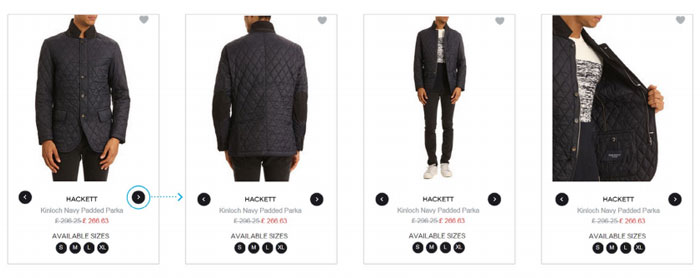
When it comes to product images, many top online retailers in the fashion industry have this dealt with by creating dynamic imagery that shows the user different product views at category level. For example, when browsing clothes on Menlook.com, the customer is able to browse through various images of a garment to see how it looks from various angles; all from the category level. They can even see which sizes are in stock, which avoids users getting frustrated when they find the garment they want, click through to the product level only to find out their size isn’t available.
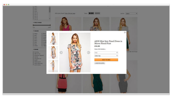
Quick view pop-ups are another way of helping the user evaluate more products at category level without the need to click back and forth.
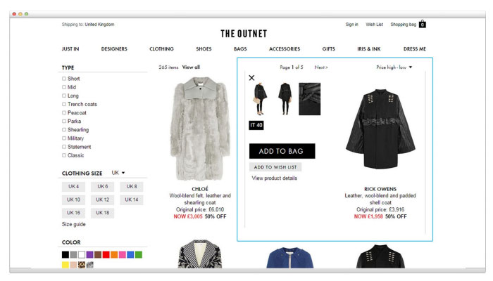
TheOutnet.com (above) enable users to ‘Quick View’ each product at category level, which shows them alternate views of the product, the sizes available and even the ability to ‘Add To Bag’ without needing to click through to product level.
A study by the Nielsen Norman Group in their latest user experience report found that users typically won’t look further than the 2nd or 3rd page. If you have a lot of products you therefore need to provide a way for visitors to easily find the products they’re looking for. Some top retailers are going beyond the common default sorting options to really help visitors drill down and find products that match their requirements.
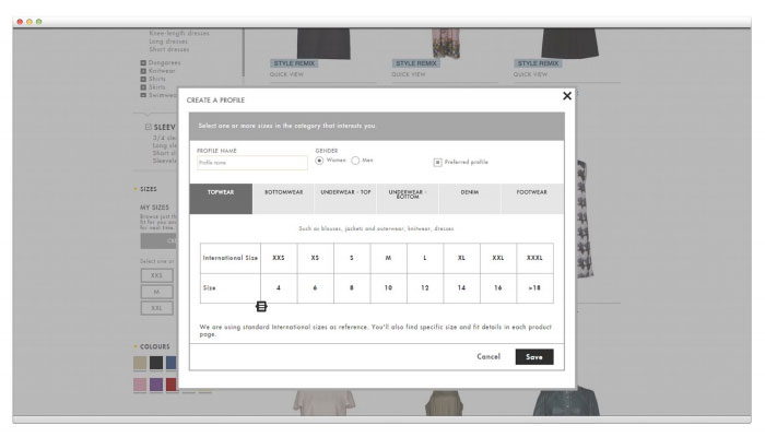
Take for example Yoox.com; a high-end fashion design store. Beyond the usual options of sorting and filtering by price/ brand, visitors are able to filter their selection by sleeve style, size, colour, print, material, toe shape, heel height and so on. Visitors can even set up a size profile of themselves, which saves the individuals size preferences and serves clothes only available for their size as they browse the site, and each and every time they visit the site.
The way in which you choose to display your products is also a very important consideration. Grids are good when an image explains most of the questions people have, whereas lists of products are better when more text and information is needed.
For example, in one study looking at how users interacted with product images, they found that “thumbnails of bookcases were studied intensely, whereas thumbnails of flat-panel TVs were mainly ignored” in favour of reading the accompanying text. The reason for this is obvious; the photos of the TVs are of little help to the user in deciding between the products.
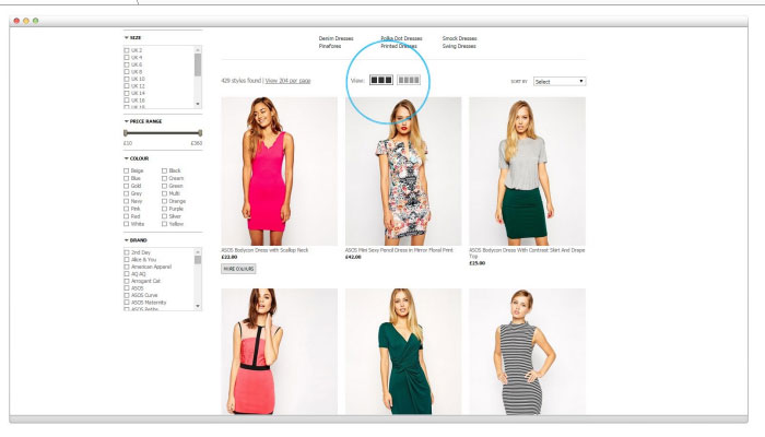
For fashion sites, high quality and well presented images are crucial to sales. Asos.com present their images using a grid view and let the user choose whether they want to view more or less products in each row.
If your best selling products are buried deep within your category page or even just below-the-fold, there’s certainly room for improvement.
To work out which of your products are most likely to sell you could use Google Analytics to work out the product page conversion rate for your products:
Number of Pageviews / Number of Purchases x 100
Of course, the demand and margin of a product should also be considered here as you don't want to position products at the top of the category page that won't bring in a large volume of orders or make a great deal of profit.
All of these tips are designed to increase the number of sales your site generates, but of course it's important to test that the changes actually do help the user and impact the rate of conversion.
The best way to do this is through controlled split testing techniques. This essentially involves testing variants of a webpage to statistically prove whether a given change has led to an increase in conversion rate.
Every page in the buying process can be improved in some way to maximise sales, and improvements to category pages can lead to a significant improvement in conversions.