Latest From The Sayu Blog


According to SaleCycle, 69.8% of online shopping carts in the Fashion sector are abandoned.
Let’s put this into perspective. If you’re currently making £15,000/ month in online revenue and you turn 20% of those abandoned orders into sales, you would make an extra £36,000 / year.
By far, the shopping cart and checkout is the most crucial element in the buying process; it’s where customers commit to a purchase and small improvements to this area of your website can make a huge difference to increasing the conversion rate and sealing more sales.
Focussing on the high street fashion sector; let’s look at 8 proven ways you can increase sales by streamlining the pages of your checkout.
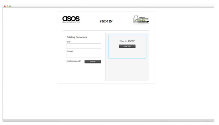
The fashion retailer ASOS halved its abandonment rate by removing the requirement for users to register on their site when moving through the checkout process.
In truth, customers do still create an account during the process, but all they do now is create a password during the standard form filling requirements such as name, email address, delivery address etc. ASOS simply removed the words ‘Account Creation’ from their checkout, and instead ask new customers to ‘Continue'.

Forced registration still remains a major friction point in ecommerce checkouts, particularly on mobile, and this example from ASOS illustrates how easy it is to reduce its impact on abandonment.
A survey conducted by Econsultancy and TolunaQuick found that 74% of shoppers would abandon a purchase due to high delivery charges.
Knowing whether to offer free delivery often comes down to your profit margins and the niche you operate in. The high street fashion sector is a highly competitive niche and many of the top performing sites in this sector offer free shipping.
Not all merchants can realistically afford to offer free delivery, and if that fits into your current situation you could consider offering free shipping when the customer spends a certain amount. Using custom dimensions and segmentation in Google Analytics it’s possible to find what price points have the highest abandonment rates. This is good input for selecting your free delivery threshold.
The ticket price is also going to be a factor in how much of an impact shipping cost has on abandonment, according to a study by SeeWhy. If you offer luxury high ticket fashion items; rolling in an extra percentage for delivery probably isn’t too much of an issue.
If your checkout is spread out across multiple pages it’s important to give your customers a visual representation of how far they have progressed.

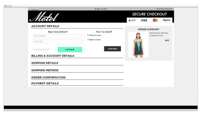
MotelRocks.co.uk is an example of a site that uses a one-page checkout whereby the collapsible vertical tabs indicate the steps that are part of the checkout process.

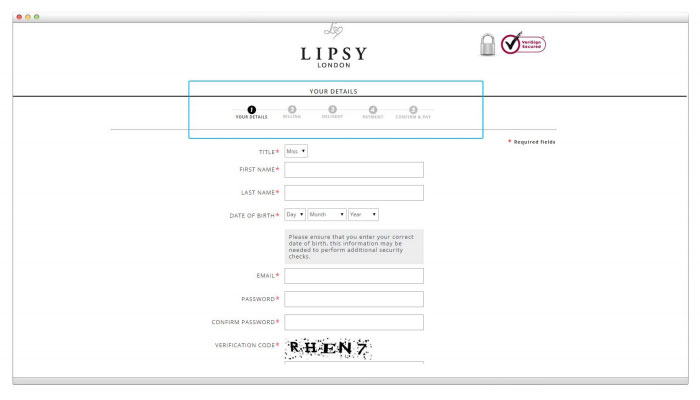
Lipsy.co.uk, on the other hand, has a multistep checkout and therefore indicates the number of steps the user can expect to pass through with a progress bar
In a study by ComScore, they found that offering a variety of payment methods at the checkout was one of the most important factors that would help customers purchase.
Adding online payment services like PayPal and potentially other options like Google Checkout could particularly help the conversion rate on mobile, since mobile users are less likely to want to enter long credit/ debit card numbers.
Not all customers have the same preferences with regards to their payment method, therefore expanding the number of methods you offer will expand your customer base.
Live Chat is the instant support service that provides help to users navigating websites. Surprisingly, only 14% of online retailers in the UK offer Live Chat, despite numerous studies indicating that it offers the highest satisfaction level of all customer service channels.
When customers are heading through the checkout process, it’s important they don’t become distracted and navigate away from the task at hand; completing their purchase. If suddenly they have a question regarding their order, the likelihood is that they will leave the checkout process to find out the answer elsewhere on the website; in the FAQ section perhaps.
Having Live Chat support could help to retain customers in the checkout process.
As we have learnt so far, when a customer is moving through the checkout process, it’s important they feel informed about their purchase and confident you’re a trusted website to do business with. They also want to know that your site is a secure one.
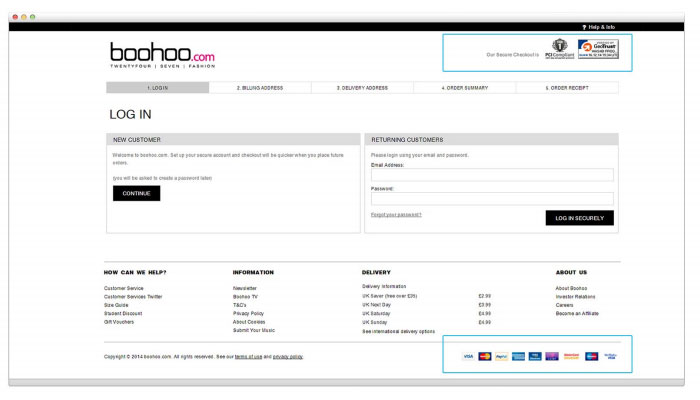
Boohoo.com is a great example of a site that uses various security badges throughout the checkout process:

The placement and combination of badges may have different results from site to site. While many studies across the Internet report an increase in sales, some report a decrease. The best strategy to take is to split test the addition of different badges.
Icons and badges for illustrating free delivery or free returns are also just as valuable for gaining trust with your customers
A popular way to entice shoppers back to their basket, should they abandon the process, is through email recovery campaigns.
In a split test carried out on Radley London, they found that cart abandonment emails led to the recovery of 7.9% of lost sales.
Sending your customer a friendly, well-timed email containing a link to their abandoned basket effectively puts you front of mind and makes it easy for them to return and complete their purchase. These customers have taken their time to add products to their basket, start the checkout process and give away their email address; so they’re clearly very interested in buying the items you’re selling. Research has found that sending your first email approximately 30 minutes after abandonment leads to the highest conversion rates. You could also experiment with sending a 2nd or 3rd email to customers that have not completed their purchase offering incentives such as free delivery or money off.
Most people shopping online expect a swift and simple buying process. According to research carried out by KissMetrics even a 1 second delay can lead to a 7% decrease in conversions. This illustrates just how important it is to continually test your website speed and optimise it for the best possible user experience. Using tools like this can help to highlight areas of your site that are slowing down its load time. Fashion retail sites usually have a large number of high resolution images, therefore compressing them correctly is just one area you should see performance gains.
All of these tips are designed to increase the number of sales your site generates, but the behaviour of customers on every website is different and therefore it’s important to test that the changes actually do help the user and impact the rate of conversion. The best way to do this is through controlled split testing techniques. This essentially involves testing variants of a webpage to statistically prove whether a given change has led to an increase in conversion rate.


